Calendar Popup Visual Documentation
This guide should give you some tips and advice when implementing the Calendar Popup Visual.
Latest update date: 09/04/2026.
1. Recommended Setup
Placement tip
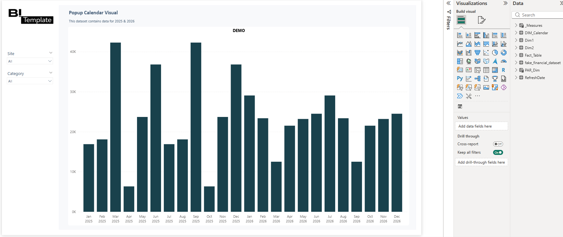
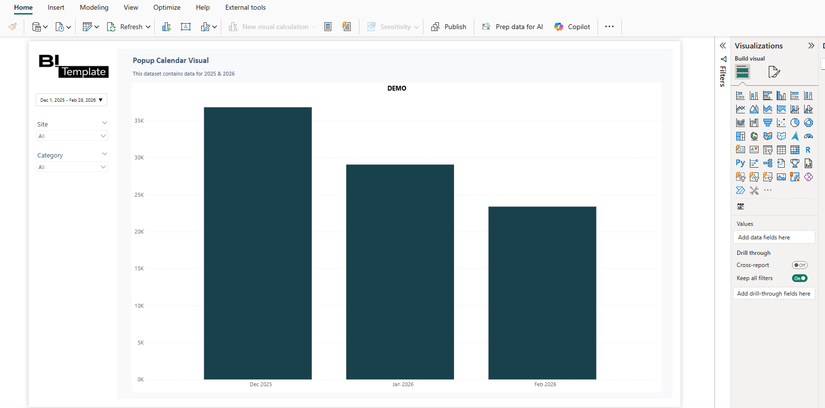
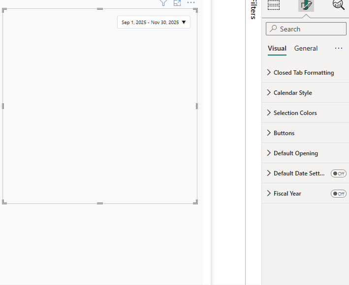
Place the visual where you want it on your dashboard canvas.
While you are free to put your date picker wherever you like, it is recommended to either put it on the top right of your dashboard canvas or on the left in a filter section.
2. Format options
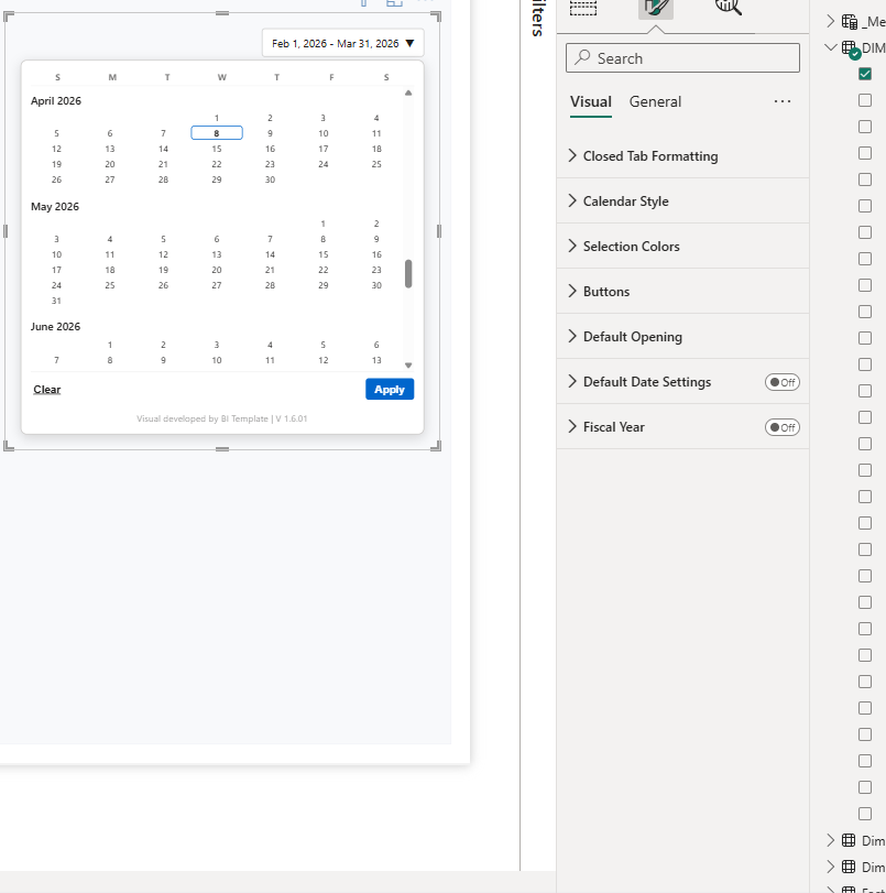
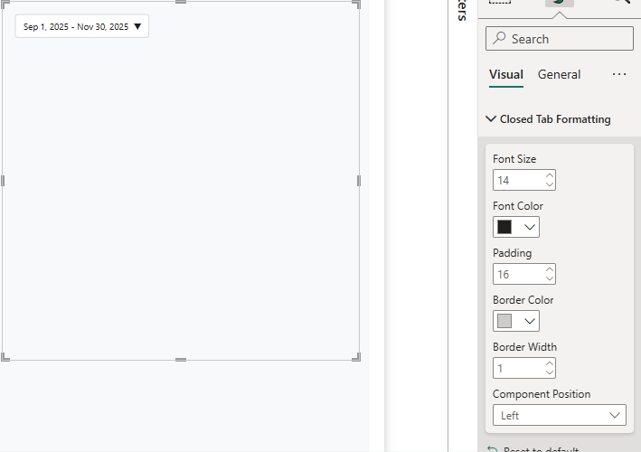
Closed Tab Formatting
This section lets you choose options for your closed visual.
- Font Size
- Font Color
- Padding
- Border Color
- Border Width
- Component Position
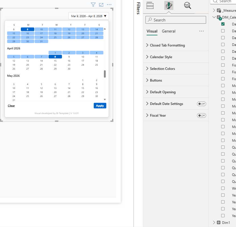
Calendar Style
This section lets you choose options for your opened calendar visual.
- Header Font Size
- Header Font Color
- Day Font Size
- Day Padding
- Popup Background
- Month Height
Selection Colors
This section lets you choose options for your default colors when selecting dates.
- Selected Color
- Selected Day Font Color
- Range Color
- In-Range Font Color
- Unselected Day Font Color
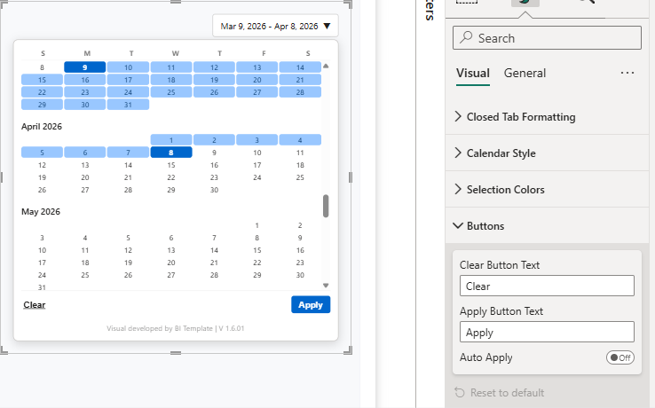
Buttons
This section lets you choose some buttons displayed in your calendar and select the auto apply option.
- Clear Button Text
- Apply Button Text
- Auto Apply
Default Opening
This is the selected default value your calendar will take when your report is published to Power BI Service.
Default Date Settings
When on, the default date selection appears in your visual, you can resize it to better fit the text on the left. You can choose to enable/disable different pre-selected dates.
Fiscal Year
You can define here the values your fiscal year pre-selected dates will take.